#I was just going to edit the stripes out of the og photo
Explore tagged Tumblr posts
Text
My live thoughts on Deadpool and Wolverine
* I’m torn between wanting to fangirl over the fight scene and wanting to sing and dance to *NSYNC
* Also I’m crying at the shots of DP doing the Bye Bye Bye choreo cut into the fight 😂
* The Iron Man helmet covering Tom in the photo with RDJ 😂
* Hearing Matthew Macfayden’s natural British accent is so jarring after watching Succession
* Wait I’m so confused on how Wade was interviewing for an Avengers position with Happy on Earth 616 and then it cuts to 6 years later on Earth 10005
* Wambsgans being the villain is insane
* This movie takes place within 3 days?
* DID THEY JUST REFERENCE THE OSCAR SLAP
* The little cgi Logan is so jarring
* *turns around* “I’m Marvel Jesus you dull creature and I-“ *gets bitch slapped by the Hulk and dies*
* HENRY CAVILL WOLVERINE VARIANT HOLY SHIT
* CHRIS EVANS?!?!?!?!?!
* IT IS CHRIS I’M FUCKING CRYING I LEGIT JUST STARTED SMILING
* JOHNNY STORM CHRIS EVEN FUCKING BETTER
* Did he just die
* I knew Wolverine was gonna just slice Sabretooth’s head off but I’m still sad there wasn’t any real fight
* Oh thank God Johnny is still alive
* Wait where’s the rest of the og FF? Where is my Ioan Gruffudd, Jessica Alba, and Michael Chiklis???
* Fuck she killed Chris 😭 I knew it was coming but it still hurts
* Why do I lowkey feel like whatever this Logan did to fuck up his world is gonna be something jokey and/or stupid
* Lady in Red playing during Dogpool’s intro 😂
* Also I did not know Dogpool was a girl
* The intro to The Greatest Show on the radio 😂
* There’s a lot of random music in this movie and idk if I’m really feeling it
* I saw a Scarlet Witch statue… 👀
* Oh shit Garner Elektra
* WESLEY SNIPES?!?!?!?! IS HE REAL OR CGI
* CHANNING TATUM GAMBIT ❤️❤️❤️
* My jaw literally dropped for these 3 I’m dead serious
* Oh this is where X23 comes in
* Wait is this Laura the same one from Logan or is she a variant
* So he’s the worst Logan because he went to a bar and the rest of the XMen got killed by humans? That’s so stupid he wasn’t even there like he didn’t lead the humans to them or run away
* Should I know who the purple girl with Cassandra is bc I feel like I should they keep focusing on her
* Should I know the bearded guy in the striped tank top bc they keep focusing on him too and I don’t recognize him
* Wait so Logan did run away when the XMen were attacked?
* Wait Logan betrayed the XMen?
* Huh so the portal was just white anyway it wasn’t an editing trick to hide anything in the trailer
* I know I should know who Pyro is but I don’t 😭
* Did they digitally elongate Emma Corrin’s fingers bc they look way too long
* Cassandra without the coat looks so sickly idk why the coat made her look fuller
* Logan’s disgusted look when Wade and Dogpool reunite 😂
* Oh I was wondering when Ladypool would show up
* I need to know if any famous actor is in the Deadpool Corps
* Logan holding Dogpool as far away from him as possible like a dirty dishrag 😂 he’s so disgusted by this dog
* WAIT LADYPOOL SOUNDS LIKE BLAKE
* Why is Kidpool a girl
* Cowboy Deadpool sounds familiar too who is he
* THE COWL 😭❤️
* I can’t make out what Blind Al says during the Deadpool fight and I really wanna know what she says 😭
* PETERPOOL
* So Logan is gonna sacrifice himself isn’t he
* Yeah I knew Wade would go in Logan’s place over the heartfelt speeches began
* And Wade isn’t gonna die he can’t he’s too popular
* Oh they both went
* Logan’s top disintegrating 😂
* “You look damn good in that suit” “I’m so sorry” I love Peter
* Wait that’s so cute they’re all in the main universe now (or Wade’s universe idk if they’re the same yet or not)
* I need to find the post credits scenes apparently they were leaked online but I can’t find them anywhere please I wanna watch them I read what they are but I still wanna see them myself
#seriously if anyone has the post credits scenes please let me know I really wanna see them#I literally just finished this movie I watched it on a 🏴☠️ site shoutout to the guy who uploaded it#The movie wasn’t even out yet in my country when I started watching it but since I went past midnight it is now 😂#Deadpool and Wolverine spoilers#spoilers#deadpool and wolverine#wolverine#deadpool#deadpool 3#Marvel#mcu
31 notes
·
View notes
Photo

There is no end to this nightmare My eyes are red from crying My heart is a vampire I am crying bloody tears
#my art#oc#original character#aerla#ic3peak#b/w art#triggering content#tw blood#mixed media#traditional drawing#digital art#I was just going to edit the stripes out of the og photo#I opened krita and 3 hours later we're here#krita#shapeshifter
1 note
·
View note
Note
would love to see you rank taylor’s album covers and maybe explain what you like/dislike about each of them one day. :) i’m not creative in the slightest and have almost no preferences about that sort of thing, so it’s interesting to hear what more artistic people have to say about them. but even as someone who’s not creative like that, i have always thought the rep cover was trash. like normally i never notice that kind of thing but it feels like that “graphic design is my passion” meme lol
Disclaimer: I am NOT a trained graphic designer, so this list and all my opinions are based on my personal taste and my “eye” for things, not any actual knowledge on what makes a cover good – though I have taken the recognizability of each cover and how it represents the album into account. Making this list has also instilled a deep loathing of the design of the Taylor’s Version packaging in me – the complete and utter lack of care put into any of it genuinely pisses me off. I wanted to say this before showing you my actual ranking, because cover-wise the albums rank higher than Taylor’s earlier work, however, I really have to say that I think all of her albums up to reputation have a spark in the album packaging design that simply was not there afterwards. I think we can blame the streaming era for this, and it makes me sad.
You can find the ranking under the cut!
1. 1989 – This is the shining star of Taylor album covers to me. I don’t think anybody can deny how easily recognizable and iconic this cover is. The polaroid adds the 80s vibe (and I LOVE how those photos defined the album packaging as a whole), the omitted eyes are mysterious and intriguing, and the handwriting makes this album cover so tactile in the sense that it feels like an actual object. I love when album covers have a sense of physicality to them, for example when the title is written on a surface somewhere in the cover photo (check out HAIMs Women In Music Pt. III), and 1989 really delivers on that. I would go as far as saying that this is one of the most iconic album covers of the 2010s.
2. RED – Going from 1989 to RED feels like a pretty significant drop in quality already, even though the original RED album cover isn’t bad by any means. There is a sense of sensuality and mystique about it and it sells the Blue homage it is attempting. My biggest qualm with this cover is the font; I don’t love Bebas Neue as it feels heavy and clunky to me, more advertisement than album cover. I think a different, more subtle font would have done wonders for this. However, it is worth recognizing that the RED cover is an established image in pop culture as well, and I think the overall design with the diagonal stripes is quite nice; it feels vintage-y and sophisticated and I love how cohesive the booklet is.
3. Folklore – I mean. Yea. This is kind of boring but it fits the album in its subduedness and I do like the imagery of Taylor disappearing in the woods/the world she has created. The folklorecover does what it needs to do and it does it well. Anything more would probably have been too much for this album. I have my complaints about the back cover and the booklet though (yes, I understand it had to be made last minute, but still… could have been better!)
4. RED TV – I actually preferred this over the og RED cover when it first came out, and I still love the photograph, but idk how much I love it as an album cover. The RED ring is absolutely FANTASTIC (see my notes on album titles being part of the cover photograph in the 1989 section), and I think this could have been my second favorite Taylor cover, had they just zoomed in on the face and the ring a little bit. I simply don’t like the framing of this photo, and it kind of ruins the whole thing for me. I am intrigued to see what she does for the rest of the recordings, but so far, I have been incredibly underwhelmed at the lack of cohesion and graphic design care put into a project that would be fantastic for collectible editions and is meant as a tribute to Taylor’s legacy. Even though most of her early covers rank below the newer stuff, I do have a soft spot for them because I cannot help but feel like Taylor’s album designs have gotten lazier and lazier over time. If I were to judge the album packaging as a whole, I think this list would look a little different.
5. Speak Now – This was spot 7 on this list but then I typed the last sentence of my RED TV review and was like !!! You know what! Speak Now is very cute and at least she isn’t lazy! This is obviously a rather cheesy album cover, and idk if I like the pretty big section that is just. White. But as I said: This isn’t lazy. The hazy fairy tale vibes are there, the painting effect is a nice touch, and I can’t help but think about how whimsy and cute the back cover and the booklet are. Yes this is not wonderful graphic design, but at least it has heart and ambition, which you cannot really say for Taylor’s album packaging from reputation onwards.
6. Evermore – Again: It does what it needs to do. It’s fine. I cannot complain about it by any means, but I also don’t love it in the slightest.
7. Fearless TV – This should be bottom of the list simply for the abomination that is the back cover, but Taylor looks super pretty in the photo and the whole thing works as an homage to the original Fearless cover. I even have a soft spot for the sepia filter until I discovered that apparently not all rerecordings would have that feature. So now it’s kind of weird. Again, you cannot tell from the cover alone, but the whole packaging just is so boring to me and just feels so churned out. Where is the fucking spark?
8. Fearless – This has spark! I kept swapping og Fearless and Fearless TV around because at least the packaging of og Fearless feels like people had fun making it, but I cannot get over my dislike for the fonts used here (which is why I prefer the European version!) Whyy is the “Fearless” so big and has a shadow around it. I don’t like it, I am sorry. I do LOVE the booklet though, it radiates joy.
9. Taylor Swift – This is a country album released by a teenager from Nashville in 2006. I think I shouldn’t have high expectations. Debut is fine. She is cute! That photo of Taylor kneeling in the pond was part of my bi awakening when I was 14/15, so I have to give it that. The notebook vibes of the booklet are a nice touch. Now that I think about it I do have love for the design of this, but I think it’s mainly nostalgia. I applaud the cohesion of the color scheme and I like the little notebook details :)
10. Reputation – I think this is terribly ugly and the only reason it is not at the bottom of this list is that I can appreciate the idea behind it. She is speaking her truth after the media has tainted her, whatever. I get it. I just think the execution is awfully lackluster (stop with the fucking white backgrounds!) and the most basic take on the “album about the media” idea (I may direct you to Faber’s I Fucking Love My Lifeas an album cover that did it better). Taylor’s face and neck also look a little strange to me. It does have a sense of recognizability, I’ll admit that. But I cannot believe this is the cover one chooses for their “taking back the narrative” album. Have a little fun! But, with all of reputation, we didn’t get what we could have gotten.
11. Lover – I HATE this. The diary theme in the booklet is cute and I don’t hate the back cover at all, but maaan I find the actual album cover to be awful. It’s a shame, really, because the album cover shoot is fantastic, but the coloring of Taylor’s face on the cover is super dull and strange, the weird sky background feels so lazily photoshopped and the font is just. Bleh. Cheesy and ugly. The CD is super super nice though, and, again, the rest of the packaging is honestly fine, but I cannot get over how actually unprofessional the album cover looks. The aforementioned weird color of Taylor’s face is honestly my biggest issue. This is just. Bad. It doesn’t make me as angry as the booklet or back covers of the TVs, but I just think it’s sooo… How does the biggest pop star in the world end up with this album cover?
53 notes
·
View notes
Text
rating (almost) every fred jones look

classic fred (several movies and series) - you truly cannot go wrong with this look. there’s a REASON they keep going back to the OG outfits and it’s because they rock. the ascot was a cultural reset and it still is. 10/10

what’s new scooby doo fred - a really nice, modern spin on the classic outfit. love me a stripey shirt. this is a fred who would bring me ice cream at 3:00am because i was crying because my girlfriend dumped me and he’s my good friend and lesbian ally. 9/10
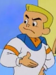
a pup named scooby doo freddie - im just gonna say it i DON’T like this fred and it’s all because of his haircut. like my mutual marce said, he looks like a trust fund baby and he should have kazoo kid hair instead. 1/10
more under the cut
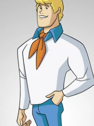
mystery incorporated fred - some people aren’t a fan of this series’ art style, but i don’t really mind it. he’s chinnegan junior and this series leans into that. some of the sdmi designs change a lil bit but this is just OG fred but pointy. he gets bonus points because this is one of my fav freds in terms of personality and that’s not really fair but this is my list of freds not yours. 7/10
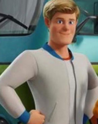
scoob! fred - why the fuck his eyes so small 3.5/10

zombie island fred - THIS IS A TOP NOTCH FRED hes got his vest on his camera ready and god help anyone who dared to disrespect his queen. also this fred proves you don’t NEED the ascot to have a great fred, the ascot is just a bonus. 100/10
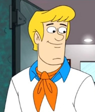
be cool scooby doo fred - okay we all KNOWWW the art style in this show is ugly as hell and i think fred looks the worst out of the gang besides scooby but he gets 3 sympathy points because the show itself is REALLY GOOD 3/10

live action fred 1.1 - VERY good casting for him and this fred also gets a bonus because freddie prinze jr. and michelle gellar were engaged and thats so cute. points are deducted from 10 for his weird OOC sexist comments 8/10

live action fred 1.2 - DO NOT LIKE THIS HAIR ON HIM i hate the bucket hat haircut and im glad it died. points are added from 0 for his improved behavior 5/10

live action fred 2 - HE’S NOT EVEN BLONDE 0/10
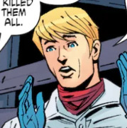
scooby apocalypse fred pre-issue 25 - a lot of panels and covers make him look like too much of a gun-slinging action hero (i found the best panel i could) but this is still a good fred. devoted to his kween and still the heart of the group, despite this series’ bleak plot. 8/10
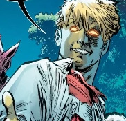
scooby apocalypse fred post-issue 25 - UMMM SKIP THIS FRED IF YOU DON’T WANT SPOILERS FOR THESE COMICS IG. i’ve still got a few issues left before i finish this series so i’m not sure how it ends or if fred is brought back at all but THIS IS NOT FRED THIS IS SOMEONE ELSE POSSESSING FRED’S BODY AFTER HE WAS IN-CANON KILLED OFF BY ZOMBIES. VERY EVIL THERE IS NO SCORE LOW ENOUGH/10
EDIT: APPARENTLY THIS IS STILL FRED BUT HES JUST WEIRD NOW BECAUSE THE REBEL MONSTERS ARE INSIDE HIM. HE’S STILL THERE THOUGH. IM SORRY FRED/10

shaggy and scooby doo get a clue fred - he’s in a total of like 2 episodes but this might be my favorite fred design/lewk ever. HE IS SO ROUND AND FRIENDLY. TOP MARKS IN ALL AREAS ∞/10
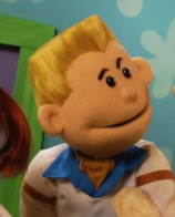
mystery map puppet fred - STOP GIVING HIM A BUZZUT -5,000/10

where’s my mummy fred - love me a fred in a vest. this is just zombie island but a different color but still fun 6.5/10

PJs fred (shaggy’s showdown, possibly others) - COMFEY but why does he still tuck in his shirt even when he’s going to sleep. he’s so dumb i love him. 10/10
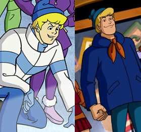
winter fred (several appearances) - this is a GOOD boy look at his little hat and his warm cozy jacket. props to the 2nd one for including his ascot. one point deducted because the striped one doesn’t have a pompom. 9/10
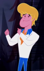
intro animation fred (several movies) - this boy looks sunburned 4/10
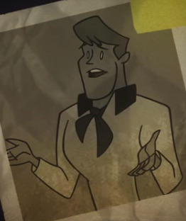
frankencreepy opening fred - this is a character from monster seeking monster. 7.5/10
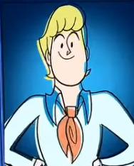
stage fright opening fred - i love the retro style!! AN INTELLIGENT BOY A HANDSOME BOY A BOY OF MANY TALENTS AND HE LOVES TO POSE FOR PHOTOS 10/10

first frights fred - when i agreed that i wanted young fred to have kazoo kid hair i didn’t mean like this never like this. what the fuck -5/10

xbox/ps2 fred - he’s going to kill me on april 23rd 2027 at 6:02pm 0̷̢̙̻̱̠͆͑͆̊̀̈͆̕̕1̸̛͉̳̙̞̭̺̯̺̹͕̤̀ͅ0̷̻̀̐͋̈́̌̀̇̈́̄̅̚͝/10
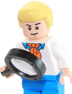
lego fred - LEGO BOUCE. LEGO BOUCE. 10000/10
#scooby doo#fred jones#scooby meta#ratings#long post#i said ALMOST every because there's probably one i missed SOMEWHERE#but if i did i didnt do it intentionally
3K notes
·
View notes
Text
“SHADOW” AIR JORDAN X RETURNS SPRING 2018.
I’m going to start off by saying, I’ve never been the biggest fan of the Air Jordan X. I always felt like they were super basic due to the fact that the most appealing part of the Air Jordan 10 is on the outsole (the bottom of the shoe). I always asked myself, why would you list Jordan’s accomplishments (at the time) on one shoe and walk on them? And secondly, why would you just add color to a few stripes on the bottom and the sock liner? Lol Needless to say, as far as OG colorways, I only liked 2 of them. I loved the “Steel” 10s because they brought a lil contrast with adding grey stripes on the upper. Then came the sneaker of the hour, my other favorite, the “Shadow.” Well, they weren’t really called Shadows or Steels back then, they were just called the new Jordans; nevertheless, it was love at first sight with those. They switched up the color, materials, and added just enough red to give a little character.
Short story long, I’m happy to see the “Shadow” 10 retro today IN OG FORM! Yea, I know they dropped in the “CDP Pack” back in 2008. I had those and let them go so many times since then. They were cool because they were a “quick fix” for my nostalgic needs; however that 23 on the side made and still makes my ass itch because he actually had a 45 on his “Player Edition.” I tried my best to overlook it, but it just wasn’t the same feeling. Thankfully, those feelings are behind me after looking at the current photos that are surfacing. Honestly, they look like they will pretty much be the closest thing we will get to the OG 1994. Once again, they hit the shelves today for $190. If you need a pair, hit me via REVAMP26.com and I will do the legwork for you! Check out the latest photos after the jump.
Stay Laced.
👟LACE.LORD👟
0 notes
Quote
The Highsnobiety Crowns are an annual awards series celebrating the very best in streetwear and street culture over the past 12 months. All shortlists are chosen by the in-house editorial staff at Highsnobiety, with the final result left up to you, the reader. Every voter will be automatically entered to win one of two prizes. This year’s grand prize is a $1,500 gift card with two runner-up gift cards valued at $500 each, courtesy of luxury shopping destination LUISAVIAROMA. Stay tuned for the final results on December 21 and see who won last year here. Sneaker culture is mainstream and there’s no way around it. Endorsements and collaborations from celebrities reached peak levels in 2017, and when Hollywood’s millennial elite like Bella Hadid and Justin Bieber are spotted at a local juice spot in the latest kicks, paparazzi photos circulate like wildfire. In some sense, seeing A-list musicians, actors (and celebrity offspring) embracing sneaker culture hugely validates what was once, for decades, a very niche interest, and in turn, we love wearing the same sneakers as celebrities. PUMA x The Weekend, Nike x Kendrick Lamar, Reebok x Gucci Mane; the list of brand x celebrity partnerships gets longer every day, but these collaborations remained a keystone in drawing many new, younger eyes toward the sneaker world. Future OGs. It’s still getting bigger and there’s no stopping it. It’s hard to pinpoint the genesis, but somehow, the tail end of normcore’s New Balance 990 obsession morphed into chunky, unconventional sneaker releases – largely championed by luxury brands – a prominent trend in 2017. Raf’s adidas Ozweego led the way, followed by the Balenciaga Triple S, YEEZY Wave Runner and many others. Knitted sneaker textiles also plateau’d as a must-have for any sneaker brand, and as a result, we saw more sock-sneakers than ever before in 2017. While Nike and adidas continued to push Flyknit and Primeknit respectively, nearly every other competitor brand trumpeted their similar solutions, from Reebok UltraKnit to PUMA EvoKNIT, as well as knitted sock-like fabrics from Dior and Balenciaga. While all that was going on, the roots of sneaker culture are still very much intact. A vast majority of the first-mover retailers, brands and characters are still in it, leading the way and being inclusive of a culture that started small, and has become so broad. At Highsnobiety, we’ve been closely surveying the sneaker world for 12 years, and with that, here are our picks for the top 30 sneakers that 2017 will be remembered for. Daniel Regan / adidas After a total of 16 YEEZY Boost releases, counting the “Pirate Black” restock and two infant-edition drops, Kanye West abruptly switched gears. Dredging up the Reebok-esque Powerphase low-top sneaker, West added subtle “Calabasas” typography in gold, but otherwise kept the ’80s-era aerobic silhouette unchanged. For fans of the 350 and 750, the Powerphase was altogether unexpected, but flew off shelves nonetheless, perhaps partly due to the fact that it was $100 more affordable than previous Boost-equipped YEEZY models, priced at $120. Kanye effectively took one of the most pedestrian sneaker silhouettes imaginable, branded with the name of a suburban California neighborhood that nobody had any reason to care about before 2017, and made it one of the most coveted sneakers of the year. George Ocampo / Highsnobiety.com Being brought into the fold as a Jordan collaborator is a career-changing moment, even if you already posses a largely unrivaled artistic acumen. Following up on his Air Max 90 and Air Force 1 collaborations way back in 2008, this year Brian Donnelly, better known by his graffiti tag KAWS, teamed up with the Air Jordan team to present a luxe take on the IV. While deep-rooted sneakerheads can easily recognize the importance of KAWS and Jordan joining forces to rework the IV, younger fans of the culture took the opportunity to brush up on their knowledge and get familiar with Donnelly’s considerable contributions (RIP OriginalFake) to streetwear over the years. The shoe featured a special mixture of materials, right down to the cage, which was crafted from premium suede instead of the silhouette’s traditional plastic accents. A glow-in-the-dark outsole and KAWS’ signature “XX” branding round out the characteristic makeup. For the remainder of the year, rumors of a subsequent, all-black family & friends model further fueled interest around the special Air Jordan IV. Eva Al Desnudo / Highsnobiety.com The Uptempo made its triumphant return in 2017, with three collaborative Supreme versions leading the charge in April. Affectionately dubbed the “Suptempos” (swapping out the Uptempo’s “AIR” typography for wraparound “SUPREME” text), the pack included black, red, and gold iterations that were seen on the feet of world class athletes Neymar Jr. and Odell Beckham Jr, a far cry from Supreme’s inner circle of seasoned skaters like Jason Dill and Mark Gonzales. Before 2017, the Uptempo may have been an overlooked silhouette as far as the general streetwear hive mind went, but many sneakerheads eagerly snapped up the general release versions that came in months to follow, in large part thanks to Supreme’s limited colorways. The Uptempo also spearheaded the general swell of nostalgia for ’90s sneakers that was big in 2017, coinciding with retro releases of more Nike basketball silhouettes of the era, like the Air Shake Ndestrukt and Air Pippen 1. Josh Sobel / Highsnobiety.com Although it wasn’t what you’d call widely accessible, the concept-proving Futurecraft 4D was a big first for adidas and the brand’s Futurecraft initiative. While there was a slight jargon smokescreen around the shoe’s revolutionary midsole, adidas explained the 4D as the world’s first performance shoe crafted with light and oxygen using Digital Light Synthesis, a technology pioneered by California-based firm Carbon, who partnered with adidas for the sneaker. Unpacking Carbon’s technology even further, Digital Light Synthesis is aiming to make injecting molding obsolete, by using light to manipulate liquid resins, opening doors for customizable mass manufacturing. The Futurecraft 4D is adidas’s first application of such a process, allowing the company to precisely address the needs of each athlete, in reference to movement, cushioning, stability, and comfort. Color-blocked, brand x brand collaborations surely aren’t going anywhere, but adidas’s partnership with Carbon is forever changing the way the world thinks about footwear, and shifting our expectations of what footwear can actually do for us. Bryan Luna / Highsnobiety Reprising their 2012 partnership, Nike and Tom Sachs teamed up to introduce a 2.0 version of the beloved Mars Yard Shoe. The original version was constructed using NASA-approved Vectran material (which is literally used in space on the Mars Excursion Rover) on the upper, and while the textile does boast considerable tensile strength and durability, over time the toe box on the 2012 version began to fatigue. Perhaps no one was in a better position to observe these unforeseen flaws than Sachs, who uses space and NASA as a repeating refrain in his work, and wore the shoe every day for years. But for 2017, Sachs and Nike instead opted for a breathable, polyester warp-knit tricot mesh, while subtle tweaks were also made to the shoe’s outsole tread and pull tabs. The shoe was initially released at Nike and Tom Sachs’ Space Camp, an obstacle course where the trophy was a pair of sneakers. The uncanny collaboration was not just a means to produce a shoe (albeit, a very special shoe), but an inspiring reminder of how ideas and experience can be manifested in a product. Patta While the inline variation of the Old Skool was cosigned in 2017 by everyone from A$AP Rocky to Kendall Jenner, Patta cooked up their own take on the classic low-top, arriving as the “Mean Eyed Cat” edition. Featuring overstated branding on the upper, midsole, and laces, the iconic Vans side stripe was offset by lateral “Patta” typography. Originally, a black colorway was released exclusively in Japan through BEAMS, with brown and white versions to follow, available through Patta in-store in Amsterdam and London, as well as online. The release flew slightly under the radar compared to certain other headline-grabbing drops, but streetwear mainstay Patta hit on a nearly perfect harmony of details and branding, elevating the classic Old Skool in just the right way. adidas Originals / Hender Scheme For years, the Hender Scheme atelier in Tokyo has been hand-making amazing homage shoes with vegetable-tanned leather, created as premium, 1:1 versions of classic silhouettes like the Vans Era and Nike Air Jordan IV. Bigger sportswear brands have been riding the veg-tan wave as well, after Hender’s creations started drawing eyes from all over the industry. But this year, adidas and Hender Scheme worked directly together (Hender Scheme’s first-ever collaboration) to create super-luxe versions of the Superstar, Micro Pacer and NMD sneakers. While the brands may seem to exist on different ends of the business spectrum, Hender Scheme founder Ryo Kashiwazaki noted to Highsnobiety that the collaboration opened his eyes to commonalities between both brands: “Although the two brands work on different scales of business, and the process is different, I feel that Hender Scheme and adidas have a lot in common.” Given the cult following around Hender Scheme and the massive popularity boom being enjoyed by adidas over the past two years, many were excited to see this project officially sanctioned in August. We wouldn’t be surprised to see part two of this collaboration arrive in 2018, possibly with some accessories in the mix. Bryan Luna / Highsnobiety.com Virgil Abloh’s “The Ten” collection with Nike was arguably the biggest sneaker release event of the year. After months of Instagram leaks and anticipation, the collection (minus the Converse Chuck Taylor All-Star, which releases Spring 2018) finally landed at retailers in November, with the Jordan 1 in a “Chicago” colorway considered by many to be the highlight of the pack. The pack is seminal for a number of reasons, largely because it features a total of 10 reworked sneakers, technically including silhouettes from three brands: Nike, Converse and Jordan. Utilizing a deconstructed motif across the entire release, Virgil noted to Nike: “The Jordan 1 was done in one design session. I work in a very like dream-like state. I see it, and it’s done.” Abloh was given unprecedented permission to chop up the iconic silhouette, unstitching the shoe’s top and bottom lace eyelets, delicately pinning Nike’s iconic Swoosh onto the shoe’s upper, and irreverently placing “AIR” branding on the midsole. Asia Typek / Highsnobiety.com First spotted on the feet of Kanye West near his Calabasas office, the Wave Runner 700 was first shown in an official context during the YEEZY Season 5 show in New York. Rumored to be co-designed by former Reebok and New Balance designer Steven Smith, the Wave Runner 700 features a chunky, orthopedic look with brazen color blocking and adidas’s Boost technology hidden in the sole. In this fast-paced world of Amazon Prime and next-day delivery, sneakerheads apparently didn’t mind waiting months to get their paws on a pair, as YEEZY stans were left to pre-order the sneaker for $300 in mid-August, before it shipped in November. The importance of this shoe also boils down to Kanye West cosigning a major trend that we’ve already seen from adidas, as well as fashion brands like Balenciaga and Dior, indicating that we’ll probably be seeing chunky sneakers for seasons to come. Converse In July, Tyler officially confirmed his departure from longtime partner Vans, finally going public with his new Converse deal. The project brought to life his Golf le FLEUR* footwear concept, using the One Star silhouette as a canvas. Initially arriving in four color choices, the low-top featured Tyler’s signature flower motif, with GOLF le FLEUR* branding on the tongue and insole, overlaid floral panels on the upper, and a floral outsole. In an interview with Dazed, Tyler made it clear that he wants people to enjoy and wear his shoes, but not belabor the designs: “It was literally pick four colorways I want to do and that was it. It’s not as intricate and deep as people be making shit out to be.” While the 26-year-old was candid about his straightforward design process, this doesn’t detract from the instant appeal of the colorful low-tops. With this collaboration, Tyler once again reinstated himself as one of the most influential characters in both fashion and music, and although the sneakers launched just this year, you can be sure to expect more drops in 2018. Asia Typek / Highsnobiety.com It was impossible to miss the rise of obtuse and unconventional shoes this year, and even Balenciaga – the most talked-about high fashion brand of 2017 – joined the party with the Triple S. The eye-grabbing silhouette inevitably became the face of the chunky sneaker trend, taking the aesthetic and exaggerating it to meme-worthy levels. Designed by Demna Gvasalia for the brand’s FW17 show in Paris, the highly unconventional design features a triple-stacked sole and pre-distressed details, which were achieved meticulously by hand, before the shoes were thrown into a tumble dryer to be battered some more, according to several sources. To create the heavily padded, triple-soled design, molds were taken from running, basketball, and track shoes. Adding some context to the design, Balenciaga described the shoe as “real, heavy-duty, high fashion-spec footwear.” Despite the divisive design and lofty price tag ($795), the shoes became Instagram status symbols almost instantly. Bryan Luna / Highsnobiety.com COMME des GARÇONS once again flexed its penchant for the avant-garde alongside longtime collaborator Nike. Reimagining the classic basketball silhouette, the Dunk High was fitted with a transparent toe and side-panels. First shown on the runway in Paris, the design will instantly remind old heads of the ESPO x Nike Air Force 1 release from 2004, which also featured transparent window panels. According to Nike and legendary COMME des GARÇONS designer Rei Kawakubo, the Dunk’s design is a “humorous nod to Hans Christian Andersen’s account of an emperor’s vain misfortune — that he was tricked into buying and wearing ‘invisible clothing,’ thus exposing himself — the collection interprets the story’s underlying contradiction of invisibility as transparency,” which also parallels the contemporary social media culture of information overload and over-sharing. Salomon / Boris Bidjan Saberi Before the YEEZY Wave Runner 700 and Balenciaga Triple S, it was arguably the utility of hiking and trail footwear that opened up the chunky-fashion sneaker category. Salomon’s mountain-ready styles – which landed at taste-making boutiques like Italy’s Slam Jam and Berlin’s SOTO – surely led this pivot away from classically minimalist styles like the Stan Smith. Special makeups with Parisian retailer The Broken Arm and later a collaboration with 11 by Boris Bidjan Saberi helped thrust Salomon into the forefront of 2017’s wave of unconventional sneakers. Even taking the current fashion climate into consideration – where cross-genre collaborations are the great equalizer, and brands are working together between disparate categories – this is still a wonderfully bizarre collaboration, and one of our favorites from 2017. Stanley Chen / Highsnobiety.com In March, Nike announced its Breaking2 initiative, a project with the goal of helping runners to accomplish a marathon in under two hours. Kenyan long-distance runner Euklid Kipchoge eventually whittled the best recorded time to 2:00:25, wearing Nike’s maximalist Nike Vaporfly Elite shoe. Based on that design, the subsequent Zoom Vaporfly SP took that same performance innovation and made it accessible to the masses, with a series of strong colorways to nurture further interest in streetwear circles. Although the shoe is an extreme example of Nike’s pure performance technology and steadfast work with the world’s best athletes – even featuring a full-length carbon fiber plate in the sole unit – the shoe was still a nearly instant success with marathoners and sneakerheads alike. Aside from the original color scheme, later releases were limited to exclusive “Shanghai” and “NYC” editions. Norse Projects/adidas Consortium Their sneaker collaborations with New Balance may first come to mind, but Copenhagen’s hometown heroes Norse Projects aligned with adidas Consortium for a pack of two shoes, including the Terrex Agravic. Possibly one of the best winter options that still has the looks and feel of a sneaker, the Terrex Agravic featured a welded upper, reinforced with a GORE-TEX membrane, and finally a Boost sole unit. You’d be hard-pressed to think of another sneaker release that blends utility and aesthetic in such a strong way. Also, in case you had any reservations about the sneaker’s performance capabilities, Norse Projects co-founder Tobia Sloth made sure to field test the shoe on a glacier in Iceland. Asia Typek / Highsnobiety.com A confluence of specific trends in 2017 proved to be the ideal circumstances for the FILA Disruptor to reemerge as a street style banger in 2017. While other ’90s staples like Kappa and Champion also saw a resurgence in popularity, FILA managed to thrive over the last 12 months for many of the same reasons. A resurgence of vintage trends mixed with the prominence of chunky sneaker silhouettes thrust the Disruptor into the spotlight as a trending option that doesn’t carry the same hefty price tag as some of its high fashion counterparts like the Raf Simons x adidas Originals Ozweego. Despite being picked up by commercial retailers like ASOS, the Disruptor was still a difficult cop, especially in the classic all-white colorway. Eva Al Desnudo / Highsnobiety.com The shoe that essentially launched the chunky sneaker trend – the adidas Ozweego, redesigned by Raf Simons – remained on the tip of many tongues this year. Perhaps 2017’s biggest street style staple at fashion weeks around the world, the Ozweego was first met with skepticism and even mockery, then embraced with open arms by fashion’s upper echelon tastemakers. Considering how long minimalistic sneakers like the adidas Stan Smith and Common Projects Achilles were dominating sneaker tastes, it seems many were simply waiting for a shoe to tip the scales. For the “Bunny” colorway, industrial branding reading “FOLD GUSSET THIS SIDE ONLY” was added to the shoe’s obtuse shape, which also featured a more pared-back mixture of white and cream tones. However, the colorway is only a small factor of the Ozweego’s success story, as the sneaker has remained a mainstay for both fashionistas and sneakerheads for several years now. Cameron Oates / Highsnobiety.com Longtime collaborators COMME des GARÇONS and Nike kicked off the year with what remains one of 2017’s biggest sneaker collaborations. Optioned in two colorways, the laceless VaporMax iteration is a near perfect marriage of fashion and technology, arriving 30 years after the original Air Max 1 debuted visible air in 1987. The shoes debuted on the Parisian runway for Spring 2017, as part of Rei Kawakubo’s “invisible clothing” concept for the season. In fact, the COMME des GARÇONS version was released at retail before even the original “Pure Platinum” colorway became available. While the VaporMax silhouette would later be treated to strong collaborations and general releases, becoming one of the most noteworthy new silhouettes of 2017 by any measure, the COMME des GARÇONS version still easily stands out 12 months later. Asia Typek / Highsnobiety.com The Air Max 97 made a major comeback in 2017. The initial, Italian-edition re-release of the Nike Air Max 97 “Silver Bullet” in late 2016 set the scene for the 97 to become one of the biggest Nike stories of this year. Coinciding with the silhouette’s 20th anniversary, Nike released a range of premium versions of the 97, as well as collaborations with the likes of Skepta and Real Madrid superstar Cristiano Ronaldo. Longtime player in the streetwear space Undefeated also imagined white and black colorways of the 97. The monochromatic designs were offset by green and red stripes, cleverly timed with 2017’s Gucci-mania heralded by newly enlisted creative director Alessandro Michele. Patent leather wraparound and subtle “Undefeated” lettering truly set the sneaker off. Nike Often, the slightly adversarial nature of sneaker culture splits people into camps, and rap phenomenon Travis Scott has always been team Nike. He’s consistently spotted touring in Jordans, and featured in a campaign for Nike’s Air VaporMax silhouette. It was only a matter of time until Scott and Nike worked together in a more direct sense, and following his relatively underwhelming Jordan Trunner LX collaboration, the Houston native tried his hand at the classic Nike Air Force 1. The immense team-up of Nike with one of hip-hop’s biggest personalities brought us an Air Force 1 with interchangeable Velcro Swooshes and a lace deubré fashioned after Scott’s signature grills. This release was a certain highlight of the “AF100” pack, which celebrated the Air Force 1’s 35th anniversary. Asia Typek / Highsnobiety.com The low-top, tennis-inspired Gucci Ace sneaker was one of the biggest Instagram flexes of 2017. The silhouette came in a spectrum of embroidered versions, with different botanical, emoji-like options to choose from, including bumblebees, lightning bolts, and Gucci snakes that were very much in line with Alessandro Michele’s overstated, nature-themed creative vision. Later in the year, the Ace was introduced in even more options, featuring badge appliqués across the laces. Extra patches were offered by Gucci for mixing and matching. While the landscape of high fashion footwear can sometimes be intimidating as an outsider looking in, the Ace was reassuring in its simple, timeless design, yet the wide variety of detail options left many prospective buyers feeling like they owned a product that was truly unique. Stussy Every new brand established in the streetwear space is essentially following a trail that was originally blazed by Stüssy and likeminded imprints. Since being founded, the brand has changed hands from the original owner Shawn Stussy, but has never sold out, remaining a leader in the space. A longtime collaborator with Nike, Converse, and occasionally Vans, September heralded the reprisal of Stüssy’s line of New Balance collaborations. A tonal, cream-colored 990 was the result of the project, reminding us that pomp and circumstance aren’t always the best ingredients in a collaboration. The sneaker appeals to today’s sensibilities, and also captivates those of us that have been around to see the best and worst sides of sneaker collaborations. The Stüssy x New Balance 990’s understated finish certainly appeals to the latter. 43einhalb For Air Max Day 2017, Nike brought back two original colorways of Tinker Hatfield’s Air Max 1, the very first sneaker to feature the advent of visible air. Featuring the same cut as the originator (Nike finally nailed the toe box, the shape of which was vastly improved upon versus previous retros), “University Red” was followed by a “University Blue” colorway, all packed in a vintage box with grey stripes and orange lid, faithfully calling back to vintage Nike packaging. These days, the term “OG” gets thrown around a lot, but it was refreshing to see a release that was truly deserving of the moniker. As the Air Max 1 will forever be synonymous with its original red-and-white colorway, this release certainly deserves a nod on our end-of-year list. sneakers.fr Working with Parley for the Oceans, adidas has been pushing ocean sustainability and recycling practices to the forefront of sneaker culture. The resulting Ultra Boost collaboration (and more Parley x adidas releases that followed) was a compelling marriage of hyped sneakers and eco-friendly manufacturing. The first actual product release came on World Oceans Day in 2016, while July 2017 ushered in perhaps the best iteration from the project, the “Ice Blue” Ultra Boost 3.0, which leveraged the Ultra Boost’s runaway popularity to give Parley a bigger platform. While resell prices didn’t reach triple-black NMD levels, and later releases like the Parley EQTs did sit on shelves, you have to applaud the fact that adidas is consciously using sneaker culture to bring awareness to a global problem that will surely affect younger generations. During a video interview with Highsnobiety, adidas Originals Senior Design Director Erman Aykurt probably put it best: “Helping us in spreading the message, when they’re flexing on Instagram, that’s the best thing that can happen to us.” Bryan Luna / Highsnobiety.com On the complete opposite end of the spectrum of Balenciaga’s obtuse Triple S sneaker, the Speed Trainer was a sleek, monochromatic knitted silhouette that started being delivered in early 2017, and has been consistently selling out all year. Available in three cuts – low, high, and extra-high – the lightweight, Italian-made sneaker was optioned in a range of pared-back colorways from burgundy to grey melange, complete with a rugged, geometric sole unit. Using its popularity on Instagram as a baseline, the Speed Trainer silhouette was truly the best embodiment of the sock-sneaker trend in 2017, at least in the high fashion world. What’s more, Balenciaga hit on a truly winning formula by having a sleek, knitted sneaker on deck, as well as a chunky, dad-core option in the form of the Triple S. Vans / Our Legacy Storytelling isn’t always prerequisite for strong design, but Our Legacy’s sneaker and apparel drop with Vans (the brand’s first-ever branded collaboration, aside from in-store exclusives for their Stockholm flagship) definitely excelled in both respective departments. Drawing inspiration from California hardcore punk culture, the pack included reworked versions of the Authentic, Half Cab, and Old Skool, featuring nylon details as well as a black-and-orange color scheme. Speaking with Highsnobiety, Our Legacy co-founder Jockum Hallin revealed that working with Vans was a major personal milestone, as he couldn’t even get his hands on the shoes when he was younger: “Vans wasn’t really available in Sweden when I was a kid, but all the bands that I admired, they all had the same shoes.” While there may be no immediate or obvious connection between Our Legacy’s signature, Swedish minimalism and Vans’s California skate heritage, the collaboration was certainly well-executed, as well as being a favorite of Highsnobiety‘s editorial staff. Asia Typek / Highsnobiety.com Far and away the most anticipated sneaker collaboration of the year, “The Ten” could quite easily have occupied 10 different spots on this list, save the Converse Chuck Taylor All-Star, which as previously mentioned doesn’t arrive until Spring 2018. Similar to Virgil’s Jordan make-up, the Presto featured several undeniably strong design twists that helped elevate it above the rest. In an age when tons of (sometimes) lazily color-blocked collaborations are releasing each and every weekend, Virgil made a point of advancing the status quo by fundamentally altering each shoe in “The Ten.” The Presto’s upper was flipped inside-out to reveal hidden seams, a reflective Swoosh was added under the shoe’s plastic cage, and a decorative foam tongue was secured to the forefoot, resulting in a surefire contender for shoe of the year. Plus, Instagram teasing from Luka Sabbat and A$AP Nast (who was gifted a specially Sharpie’d “AWGE” pair), pushed the interest around these Prestos to peak levels, months before they even released. Asia Typek / Highsnobiety.com There was no shortage of Vans collaborations in 2017, from disruptive streetwear startup Anti Social Social Club to legendary haute couture designer Karl Lagerfeld, but one of the better examples came in the midst of summer from Alyx Studios. While the statement lighter cap detail was objectively a strong, original touch across a handful of Vans sneakers, the release’s true merit stems from the archival silhouettes picked out by Alyx founder Matthew Williams. Dredging up several styles that have been absent from the Vans catalog for some time, Style 29 was fitted with a chunky lug sole, while Style 36 featured toecap stitching that was faithful to the original Vans design worn by prisoners. The pack was strong in its entirety, but the best fit for core sneakerheads arguably was the parchment-colored Authentic which featured streetwear-friendly Alyx branding on the midsole. @Seanwotherspoon / Instagram The face of curated consignment shop Round Two, Sean Wotherspoon was the winner of 2017’s Nike Air Max Day “RevolutionAir” contest. Designed in collaboration with the likes of Ben Baller and A$AP Nast, his concept sneaker saddled the Air Max 97’s upper on an Air Max 1 sole unit, going even further to replace the 97’s rippling 3M panels with characteristic corduroy in a pastel color palette. Wotherspoon made sure to really finesse the details, also including Velcro patches on the tongue for mixing and matching, in addition to an infrared air bubble. Although the shoe was originally slated to drop on Air Max Day 2018, several limited release events were held before the end of the year at Union in Los Angeles and Need Supply in Richmond, Virginia, the latter of which was actually canceled when a mob showed up at the shop’s front door. Andrea D'Auria / Highsnobiety.com Aside from collaborations with Public School, John Elliot, and Travis Scott, Nike unleashed a grip of strong general release Air Force 1s in 2017. While it didn’t come with an official title, the affectionately nicknamed “Mini-Swoosh” (we see you Alexandra) pack included three colorways, each splashed with mini Nike Swooshes across the upper. The sneakers offered the look and feel of a personalized pair, but despite how they may have looked at a distance, these were no Sharpie customs. The Highsnobiety Crowns are an annual awards series celebrating the very best in streetwear and street culture over the past 12 months. See all of this year’s nominees here.
https://www.highsnobiety.com/2017/11/27/best-sneaker-2017/
0 notes